Saturday,
November 29, 2003
I’ve been playing with GridPanel today and really
like how elegant it is. If I say the following:
<GridPanel>
  <SimpleText>Testing</SimpleText>
  <SimpleText>1</SimpleText>
  <SimpleText>2</SimpleText>
  <SimpleText>3</SimpleText>
</GridPanel>
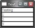
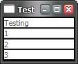
I get the equivalent of an HTML table with four rows with
each SimpleText element forming a cell like so (augmented with Border elements
not shown above to accentuate the cells):
If I want to split the data into columns, I can do that using the Columns
attribute:
<GridPanel Columns="2">
  <SimpleText>Testing</SimpleText>
  <SimpleText>1</SimpleText>
  <SimpleText>2</SimpleText>
  <SimpleText>3</SimpleText>
</GridPanel>
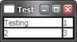
Which gives me two rows of two columns each:
That’s all nice and simple, but still flexible. For example, if I want to set
the Testing string to cover two columns, I can give it an ID in the XAML and
call the GridPanel.SetColumnSpan static method in code, e.g. when the Window
loads:
<!-- xaml -->
<Window ... Loaded="window1_Loaded">
  <GridPanel Columns="2">
    <SimpleText ID="testingSimpleText">Testing</SimpleText>
    <SimpleText>1</SimpleText>
    <SimpleText>2</SimpleText>
    <SimpleText>3</SimpleText>
  </GridPanel>
</Window>
// C#
void window1_Loaded(...) {
  GridPanel.SetColumnSpan(testingSimpleText, 2);
}
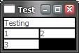
This code yields 3 rows arranged as follows:
This is all fine and makes you appreciate the elegance of the GridPanel.
However, that’s not what inspired me to write this entry.
Remember that
the SimpleText element serves as a cell in the GridPanel. Even better, the
SimpleText element doesn’t know it’s serving as a cell in a GridPanel. The
architecture of Avalon is loosely-couple so that all of the elements don’t need
to have intimate knowledge of each other. This loose coupling is really great
for future elements that some developer wants to host in a GridPanel or that
want to host SimpleText elements. Still, I’d like to be able to set GridPanel-related
properties for each “cell” on the cell element itself, even if the cell element
doesn’t know it’s a child of a GridPanel. And that’s what the extended attribute
syntax in XAML lets me do. Instead of writing the code, I can just do this:
<GridPanel Columns="2">
  <SimpleText GridPanel.ColumnSpan="2">Testing</SimpleText>
  <SimpleText>1</SimpleText>
  <SimpleText>2</SimpleText>
  <SimpleText>3</SimpleText>
</GridPanel>
This dotted attribute syntax allows me to set a GridPanel
setting for the SimpleText element w/o any knowledge from the GridPanel of the
SimpleText or vice versa. That means that if I define the FooBar element
tomorrow, I can set it’s GridPanel.ColumnSpan on it when it’s used inside a
GridPanel w/o extending GridPanel. This also means that if FooBar has a Quux
per-child property, I can set the FooBar.Quux attribute of the SimpleText
element w/o extending SimpleText. Nice!
BTW, if you’d like to see the code
that provides the GridPanel in “outline mode” as above, it looks like this:
<Border Background="black" Width="100%" Height="100%">
  <GridPanel Columns="2">
    <Border Background="white" GridPanel.ColumnSpan="2">
      <SimpleText >Testing</SimpleText>
    </Border>
    <Border Background="white">
      <SimpleText>1</SimpleText>
    </Border>
    <Border Background="white">
      <SimpleText>2</SimpleText>
    </Border>
    <Border Background="white">
      <SimpleText>3</SimpleText>
    </Border>
  </GridPanel>
</Border>
Notice that the GridPanel.ColumnSpan is on the Border
element, not the SimpleText element. That’s because it’s the Border that’s the
cell of the GridPanel, not the SimpleText.